A simpler way to find your next tennis match
The challenge
A tennis player in Lithuania who wants a match has two options: play with people they already know, or find someone new. Tenisopartneris.lt exists for the second case. It lets players find partners at their level, join tournaments and book games.
The users are not one group. A league player wants to filter by level and skips instructions. A beginner opening the site for the first time doesn’t know what a rating means yet, and leaves at the first screen that requires guessing. The old interface had grown feature by feature, so both groups worked through the same accumulated complexity: several paths to the same action, and navigation that assumed you already knew the system.
For a platform whose whole value is lowering the barrier to playing tennis, that was a real cost. Every confused beginner was a lost user, and beginners were the growth audience.


The approach
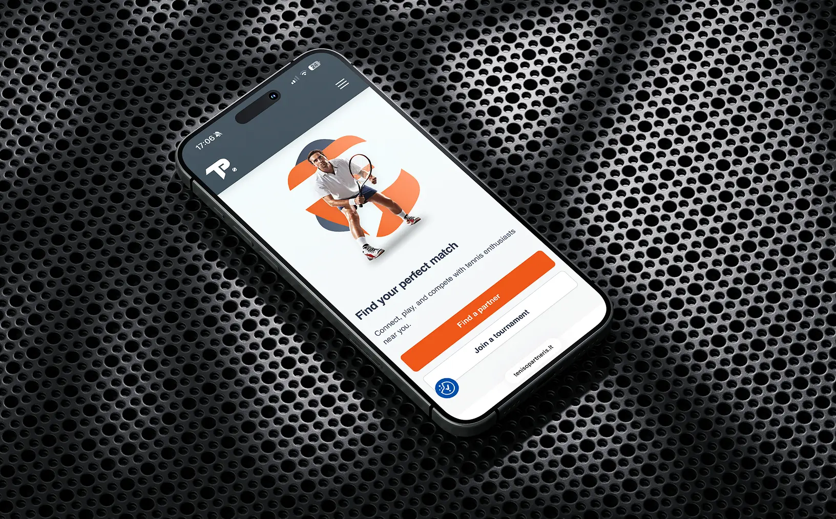
We started by separating what the platform does from what people come to do. The feature list was long. The user intents were two: find a partner, join a game. That became the rule for every screen: if an element didn’t serve one of those two paths, it moved deeper into the interface or out of it.
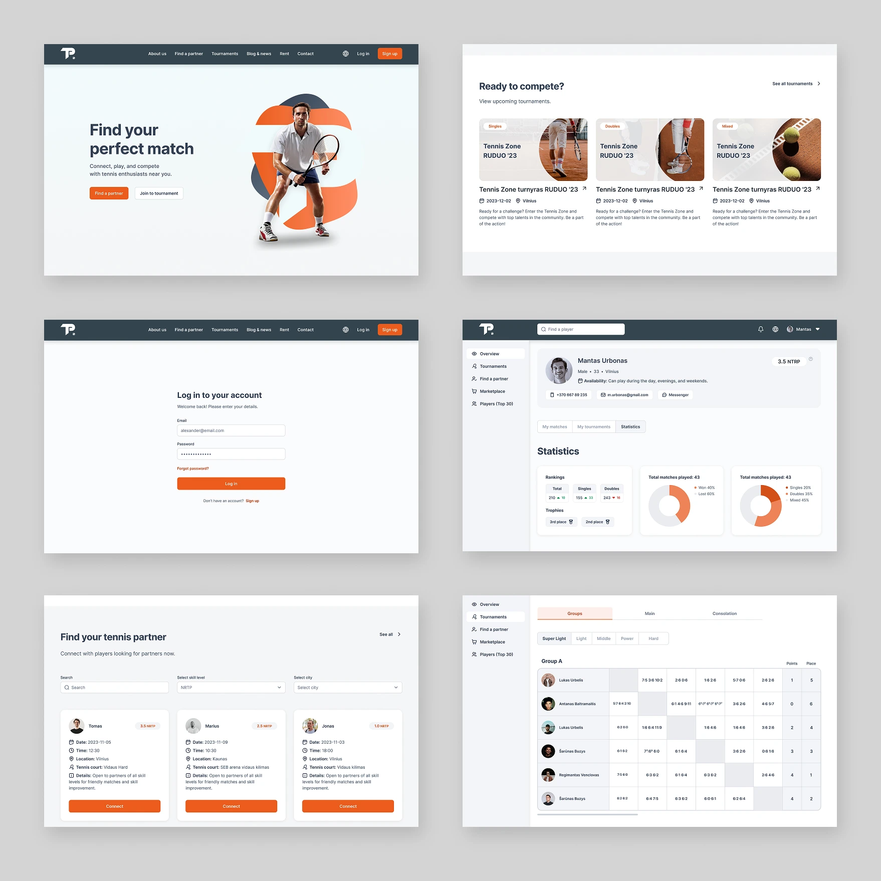
The harder part was not the landing page but the logged-in system. It has many page types and functions, and it is where a beginner decides whether the platform is for them. We applied the same rule there: default views show the simple path, advanced options exist but don’t compete for attention. We treated the beginner as the design constraint, on the logic that a league player can handle a simple interface, but a beginner cannot handle a complex one.
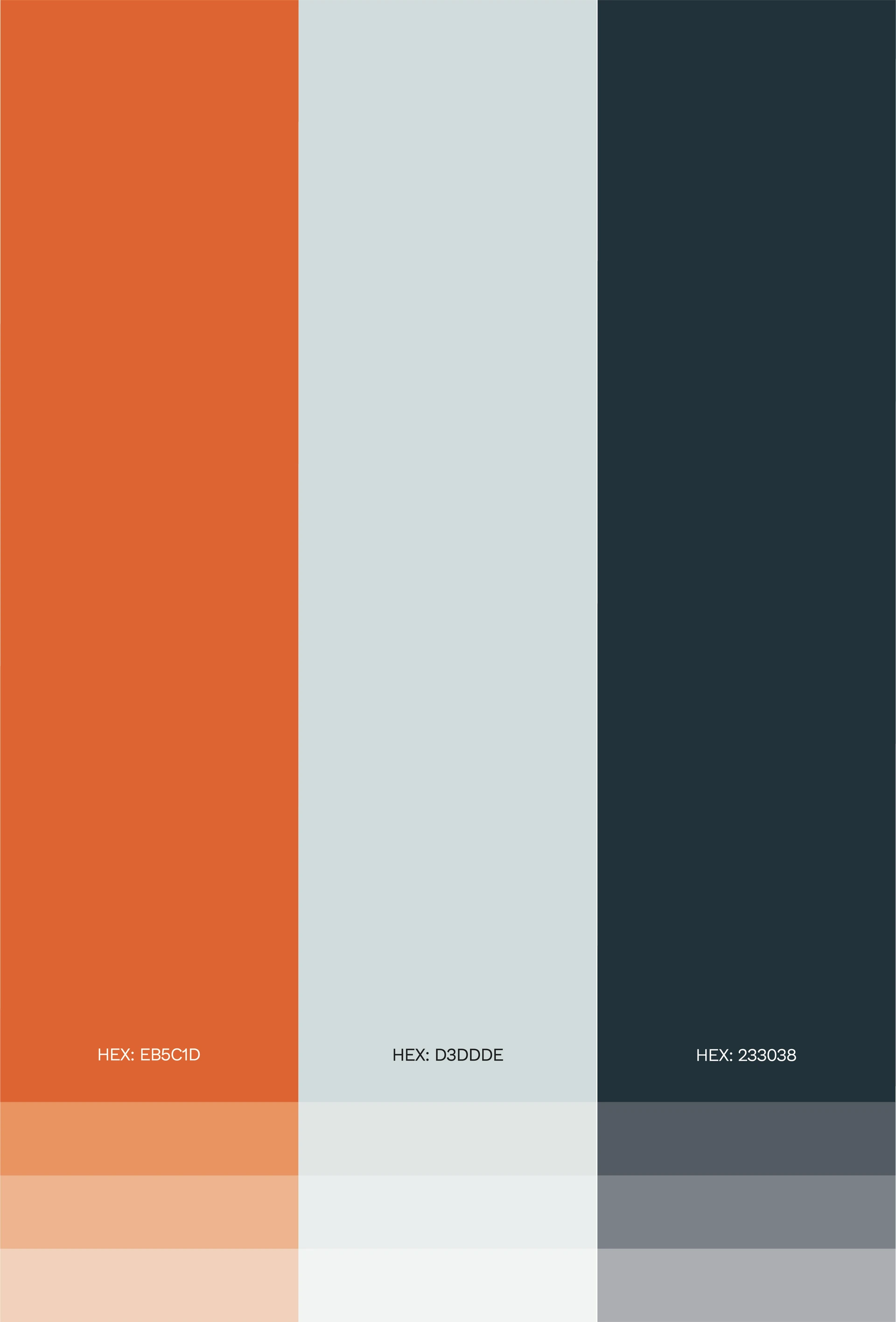
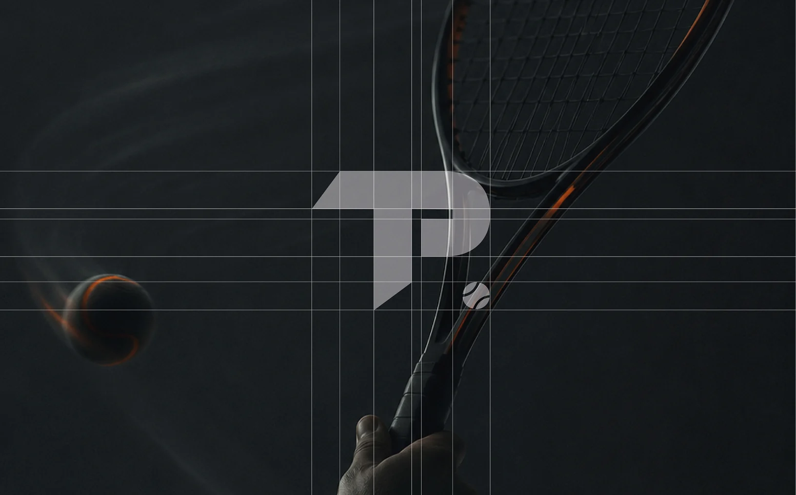
The identity had a different job: the platform needed to look like sport, not like an admin tool. Orange carries the energy of the game, dark blue keeps it credible, and the redesigned logo lets the platform be recognised outside its own website.
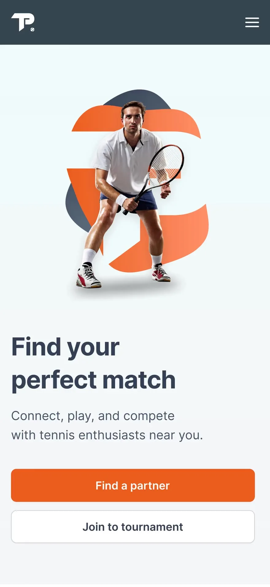

Obvious for beginners. Fast for regulars.
Default views show the simple path; advanced options stay one step deeper. And the identity looks like sport, not like an admin tool — orange for the energy of the game, dark blue to keep it credible.

The outcome
The two core actions now take fewer steps and no prior knowledge of the system. A first-time visitor can get from the homepage to a joined game without instructions, which was the test we designed against from the start. The client’s own measure of success was the same one: with this many functions, it had to work for a beginner browsing.
Tomas K.
Co-founder, Teniso Partneris
“Excellent communication, dedication and attention to detail. Everything was done as planned and on time. With many functionalities, it had to be intuitive for beginners, and they delivered exactly that: a seamless landing page and a well-structured internal system.”
Keep scrolling