Plastic surgery with the calm of a spa
The challenge
Choosing a plastic surgeon is one of the most personal decisions a person makes, and before they book, people look for one thing: whether they can trust the clinic’s judgement. Gist Clinic wanted to be seen the way it works, closer to a spa than a hospital. The identity had to be professional and quietly high-end, minimal but never cold, with a light warmth that makes the first visit feel easier.
The hardest part was the logo. Plastic surgeons look at faces, symmetry and proportion more closely than almost anyone, and harmony is the core of their work. A mark that was even slightly off would be noticed by exactly the people it represents.
The approach
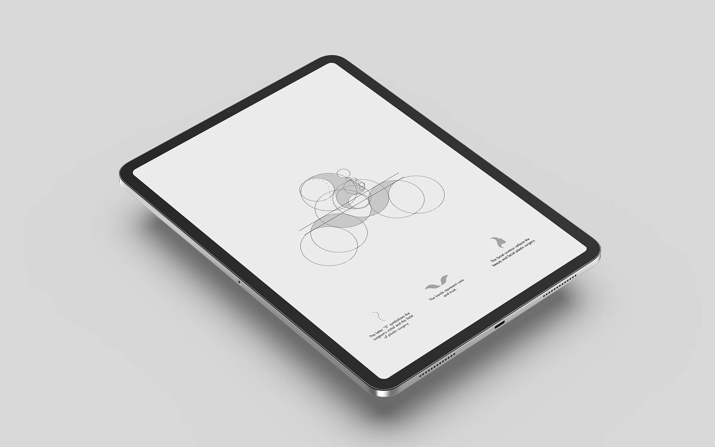
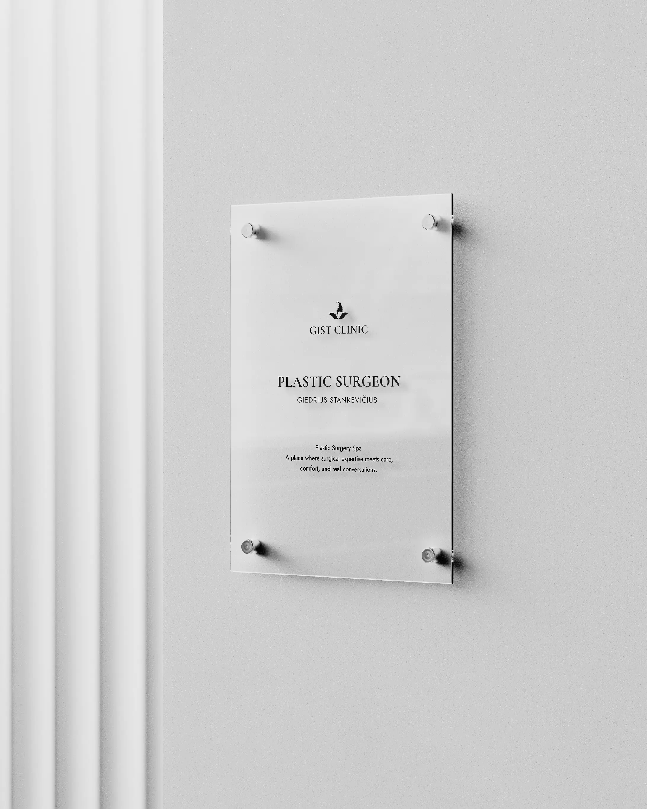
We built the mark on the golden ratio. The clinic never asked for it, but for people whose work is proportion, the logo had to be measured the same way. It joins three ideas in one line: a facial contour for facial surgery, two hands for care and trust, and the S of the surgeon’s name. We adjusted the curve of the nose several times until the profile read as balanced at every size.
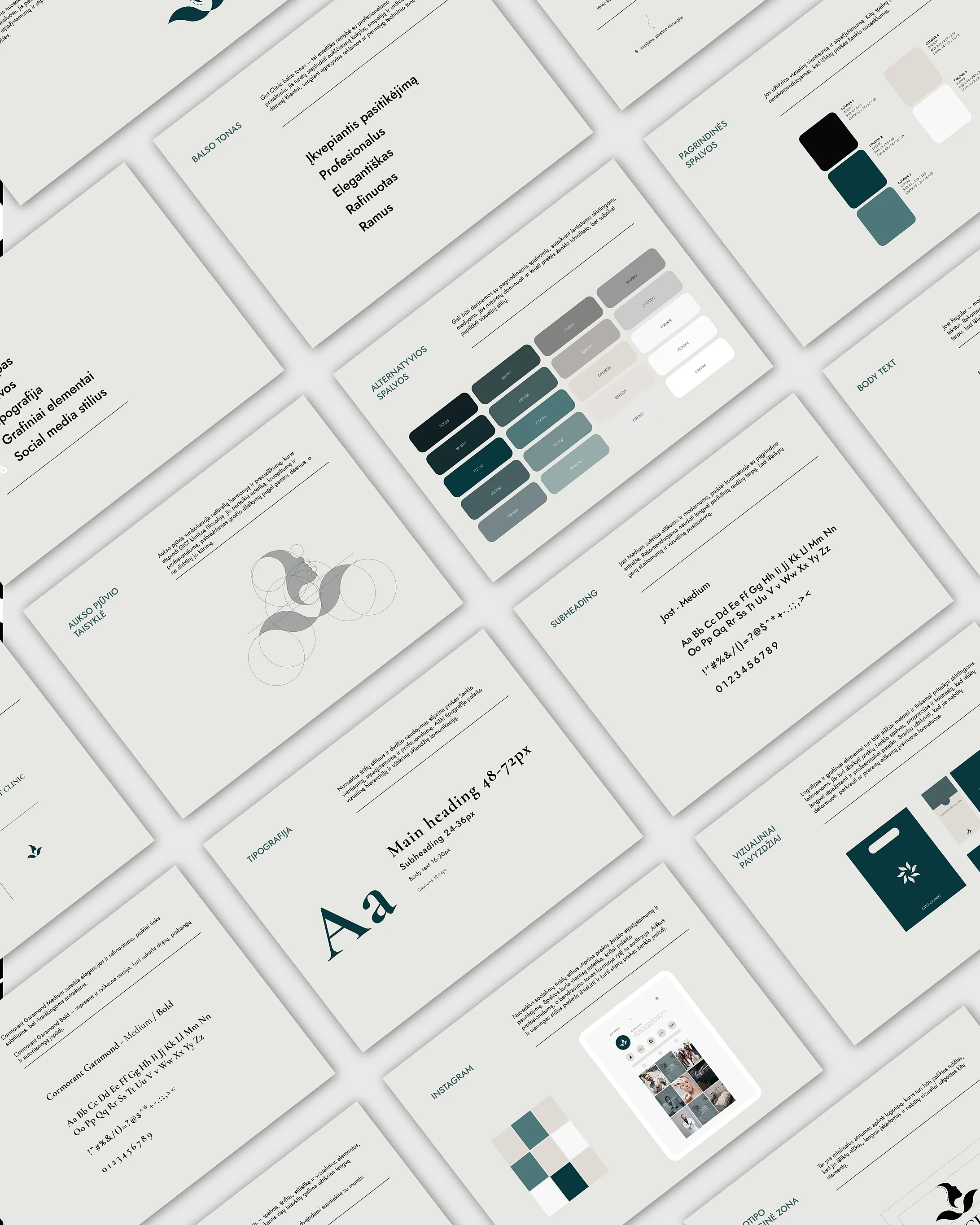
Around the mark, the system stays quiet. A deep teal with warm greys replaces the clinical white and blue of the category, Cormorant Garamond sets the headings and Jost the text, and every surface is given room. The guidelines also define the voice: confident, professional, elegant, refined and calm.
Harmony you can measure.
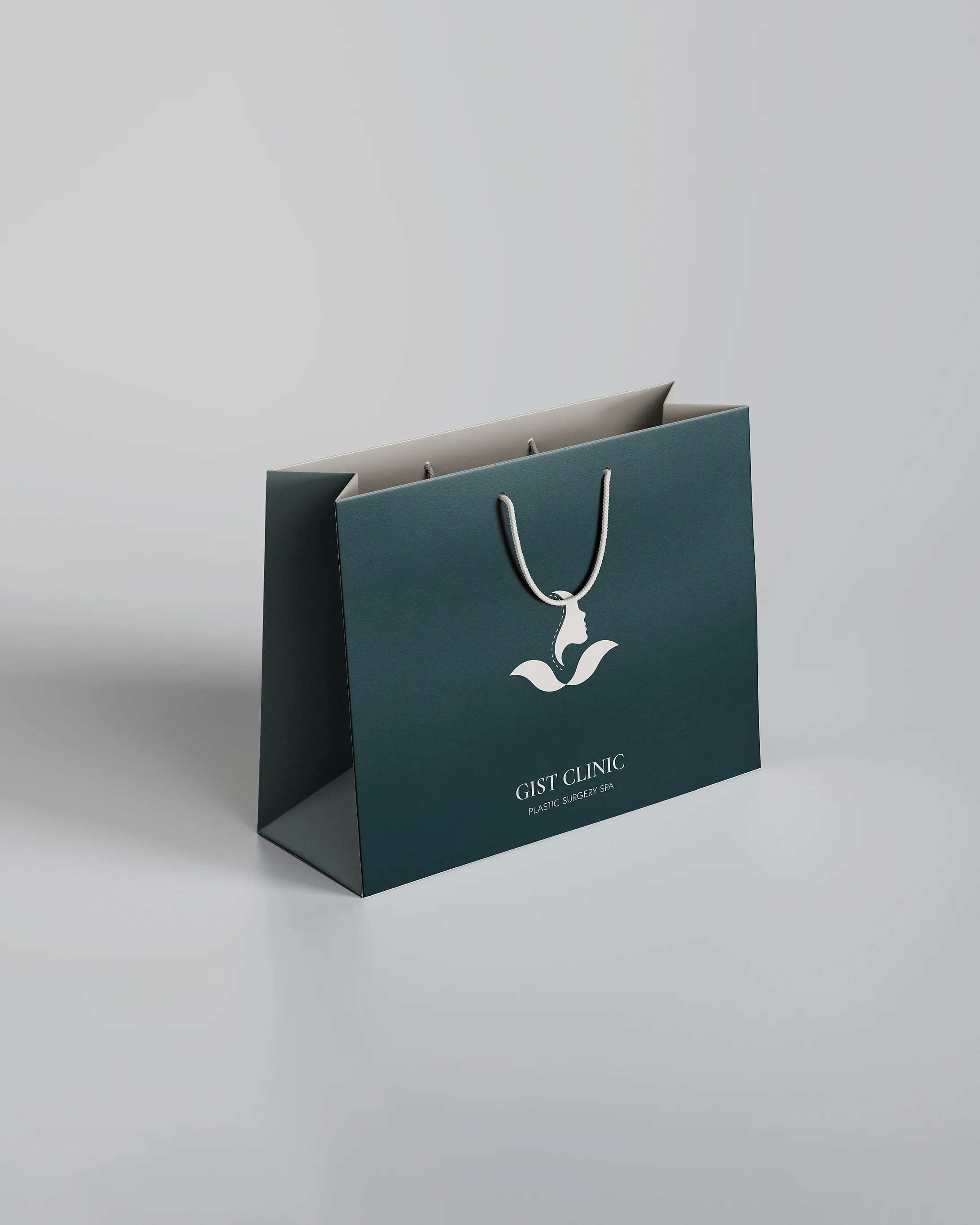
The mark is drawn on the golden ratio, for a client whose work is proportion. A facial contour, two hands and the surgeon’s initial meet in one quiet line.
The outcome
Gist Clinic now has an identity that matches how it treats patients: precise, calm and warm. The guidelines cover the logo, colours, typography, graphic elements and social media, so every new material stays consistent. The website is next, built on the same system.
Keep scrolling
Back to all work