Making enterprise HR software feel approachable
The challenge
The buyer of SmartStart is an HR lead at a company of 100 to 2000 employees. They know their spreadsheets and legacy tools have stopped scaling, and they know a platform like SAP SuccessFactors would solve it. What stops them is the reputation of the category: enterprise software means year-long rollouts, consultants and budgets approved at board level. For a 300-person company, that is usually where the conversation ends.
Jigsaw Cloud, a UK SAP partner, built SmartStart to remove that barrier: a pre-configured SuccessFactors package that goes live in weeks. But the offer had a contradiction built in. It carries the SAP name, which brings credibility and the enterprise associations at the same time. The brand had to keep the weight of SAP while removing its intimidation, and no brand existed yet to do either.

The approach
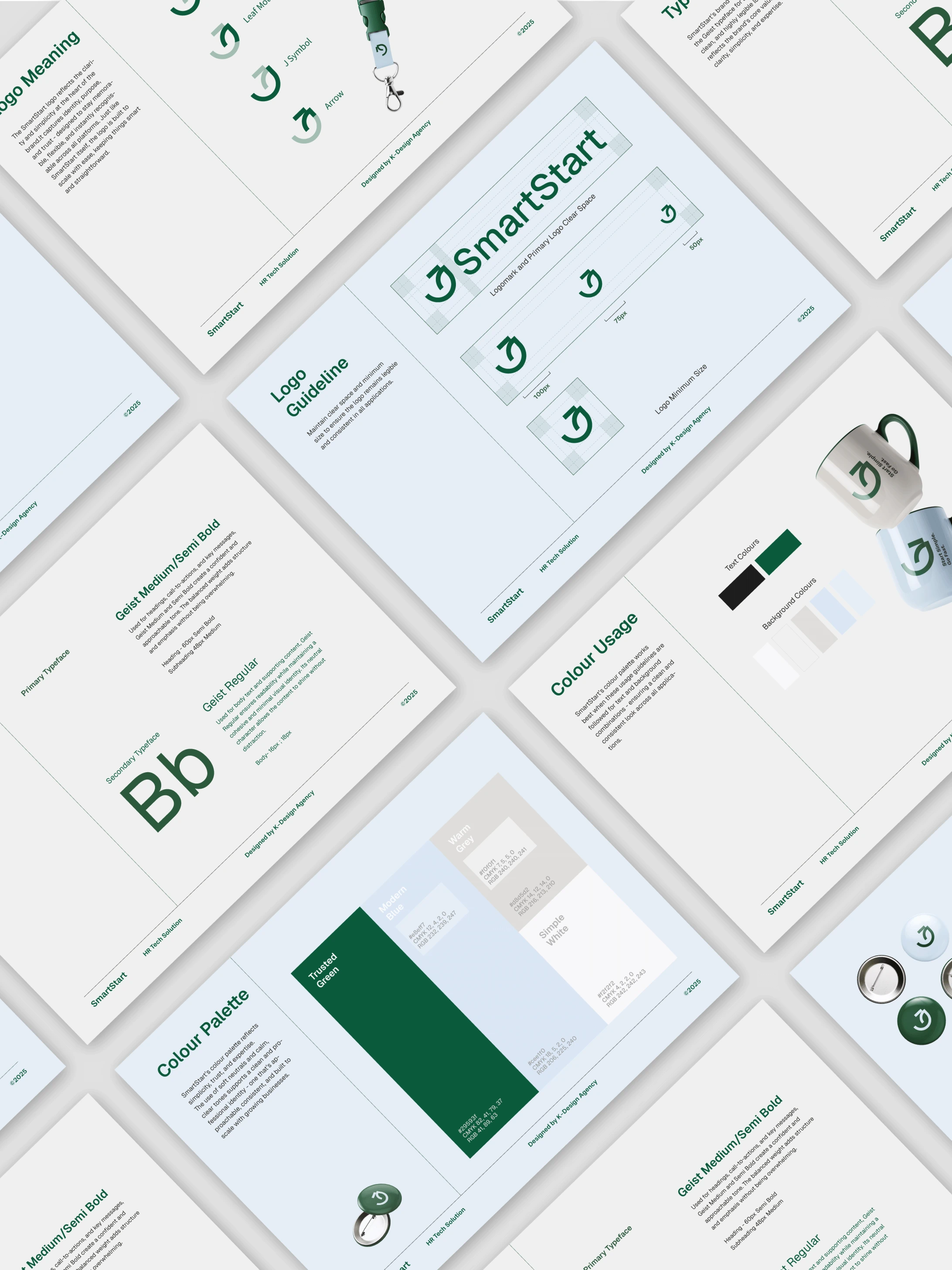
That contradiction set the direction. If SmartStart looked like SAP, the audience would assume it costs and behaves like SAP. If it looked lightweight, the buyer wouldn’t trust it with systems next to payroll. We resolved it with an identity that sits visibly apart from the corporate software category while staying serious in structure, and documented it in a brandbook so Jigsaw Cloud’s team can keep it consistent without us in the loop.
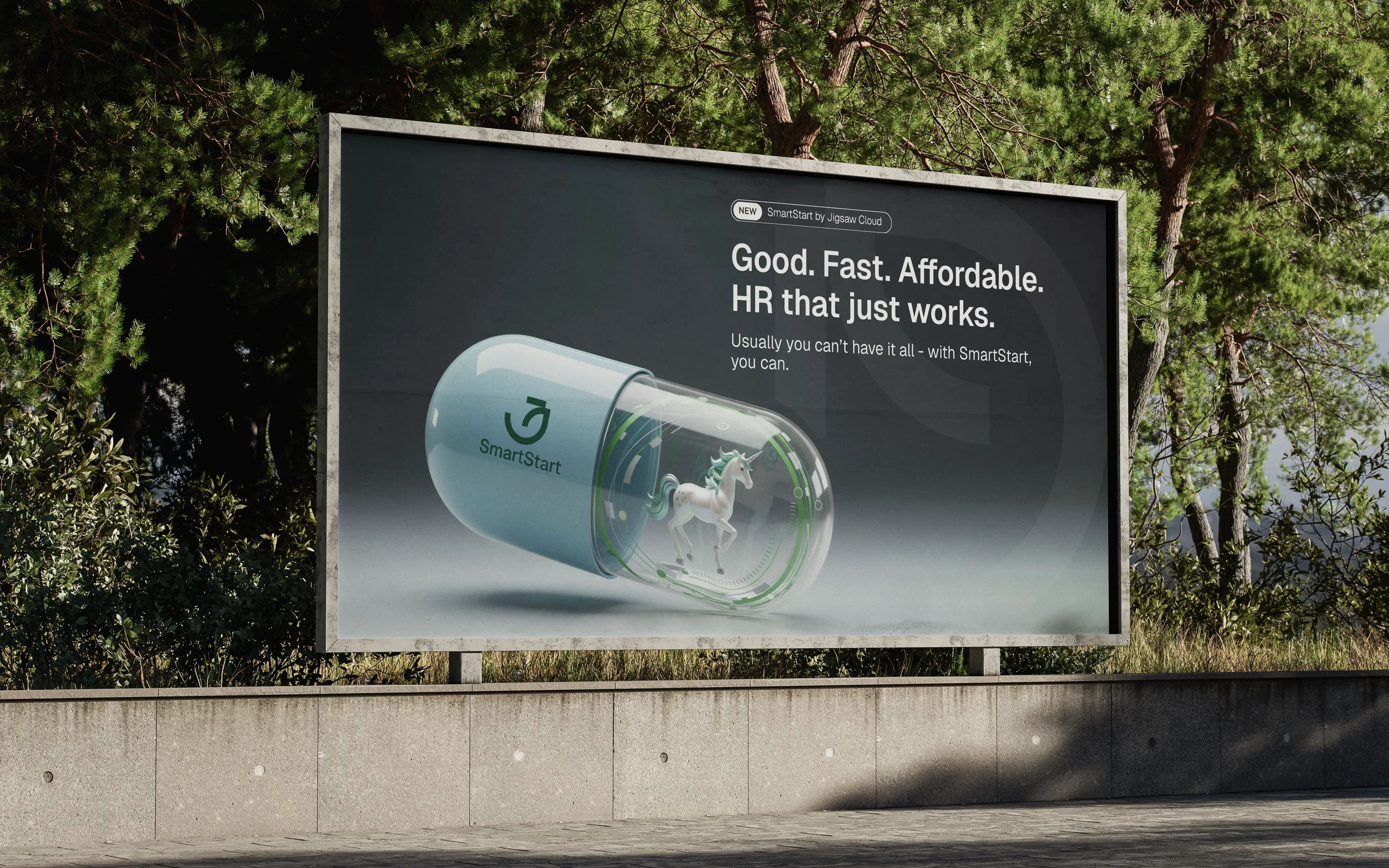
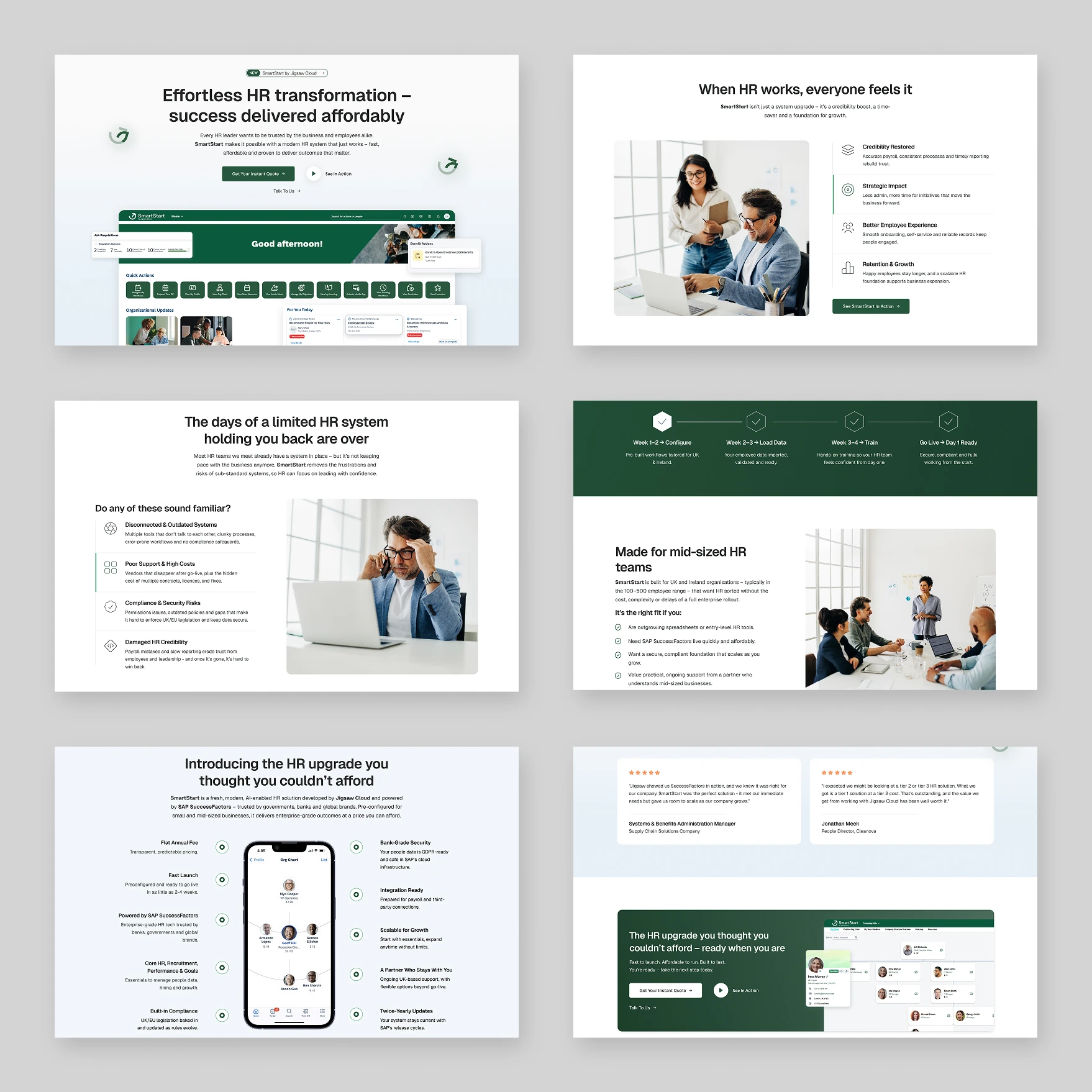
For the landing page we made one structural decision: the page follows the buyer’s questions, not the product’s feature list. SAP’s own documentation already serves people who want features. This page starts from the problems an HR team recognises in their own week, shows what changes when those problems are handled, and answers the real objection with a timeline of 2 to 4 weeks. Marketing materials, from the product booklet to the ad creatives, reuse the same structure, so the sales team tells one story at every step of the funnel.
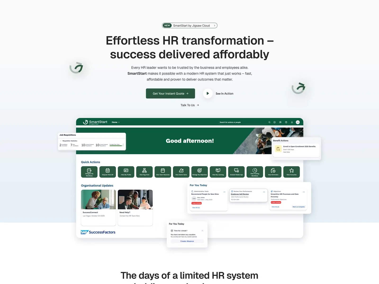



Enterprise weight, without the intimidation.
The identity keeps the credibility that comes with SAP while stepping visibly outside the corporate software category — serious in structure, approachable in tone, and documented so every new asset stays consistent.
The outcome
SmartStart went to market as its own brand instead of a line item in Jigsaw Cloud’s service list. The sales team has a system to sell with: a page that answers the enterprise objection before it is raised, materials that match it, and guidelines that keep every new asset consistent.
Laima G.
Jigsaw Cloud
“They translated a complex brief into a clean, modern visual identity and digital assets that reflect both our brand personality and commercial goals. Their input solved the challenge of aligning creativity with strategy, something that had been missing in our previous design collaborations.”
Keep scrolling