A skincare brand that speaks less
The challenge
Lithuanian cosmetology brands tend to look alike: soft neutrals, delicate typography and before-and-after grids.
MOI’s founder takes a different approach: international training, ingredient-level expertise, personalised skincare plans and no unsupported promises. Yet none of this was reflected in the brand.
With plans to expand into professional retail, home-care protocols and education, MOI needed a visual identity that could grow with the business.
The approach
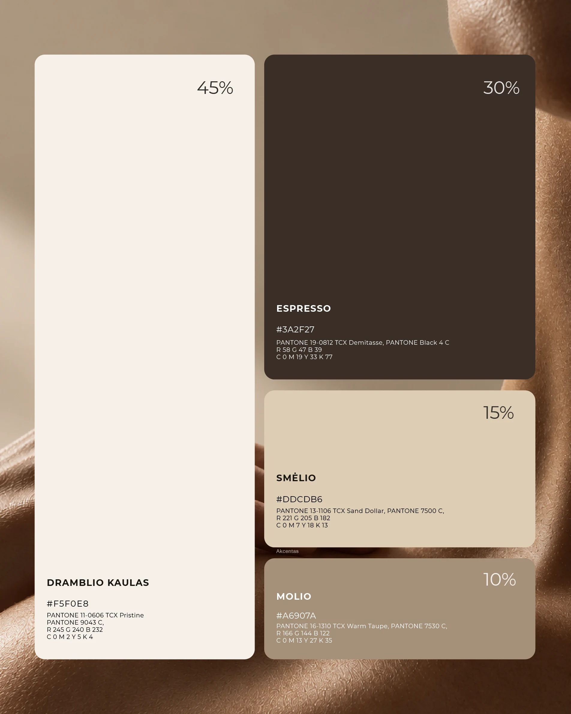
Instead of introducing another colour, we focused on contrast. We kept the warm neutral palette the founder wanted and introduced a deep espresso tone, making up around 30% of the visual system and setting MOI apart from its competitors.
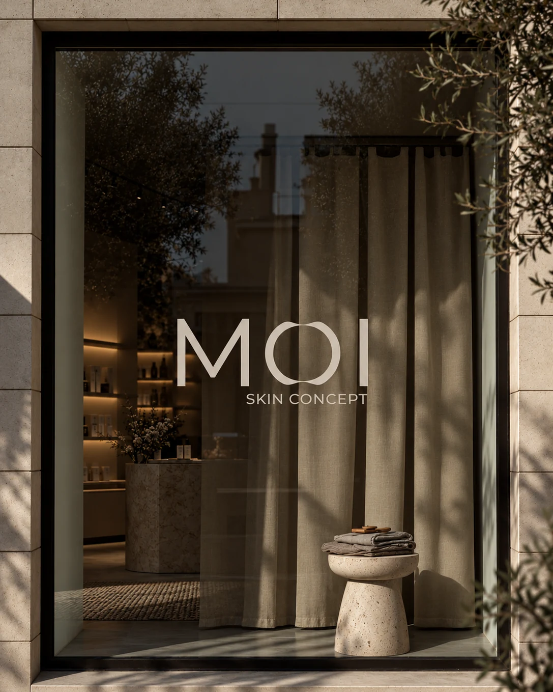
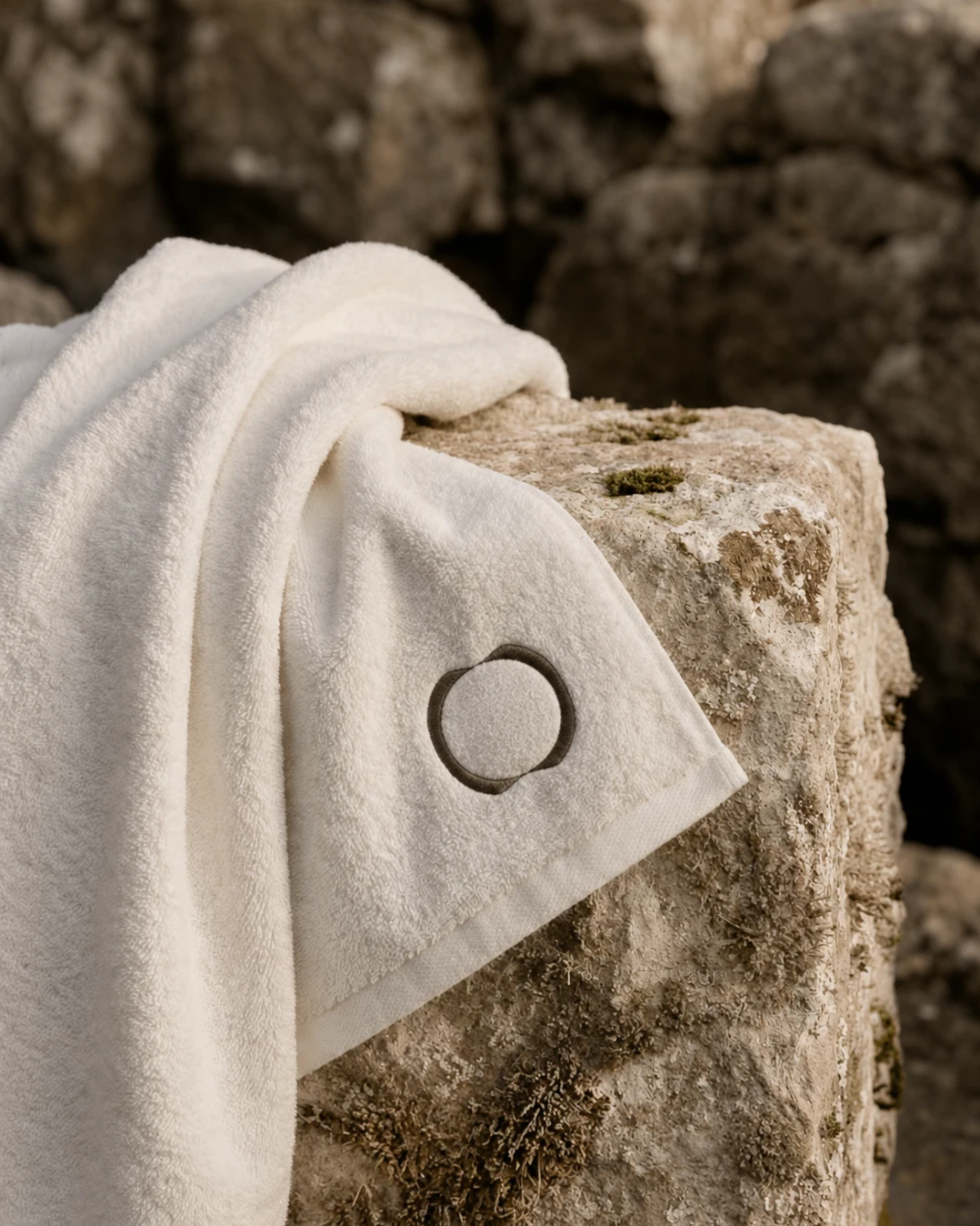
MOI stands for mano odos istorija, my skin’s story. The letter O is formed from two mirrored halves coming together as one. Built directly into the wordmark, it also works independently across social media, embroidery and stamps.
We designed with real-world use in mind, testing the logo at different scales and keeping the system simple: one graphic element and two typefaces, Montserrat for everyday communication and Cormorant Garamond for decorative accents.
Quiet is a decision, not a default.
Every element had to earn its place. Anything unnecessary was left out.
The outcome
We created a complete visual identity with ready-to-use templates for skincare recommendation cards, price lists, gift vouchers and Instagram.
Now the founder can manage her everyday brand communication without needing a designer for every small update, while keeping everything consistent.
Keep scrolling
Back to all work